Designing a Dashboard That Makes Practice Stick
A learner dashboard for an AI-powered speech coaching platform, built with gamification, progress tracking, and a design system I implemented in code.
ReactNext.jsTailwindFigma
The Brief
Rooh is an AI speech coach that helps users improve communication through practice and real-time feedback. The existing dashboard felt dated and didn't motivate users to return. I redesigned the learner dashboard, created a design system, and built the frontend.
My Role: Front-End & Design Engineer Intern (Dashboard Design, Design System, Frontend Implementation)
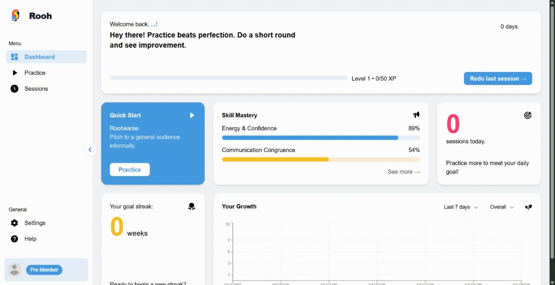
The Problem
I documented several UX issues with the original dashboard:
- Greeting showed "Welcome back, USERNAME" instead of the user's first name
- No clear primary color: pink, yellow, and blue all competed for attention, making the interface feel unfocused
- No way to view the rest of the skills beyond the top three with most mastery
- Practice games lacked descriptions: users didn't know what they were clicking into
- Most graphs of user progress lacked axes or information
The Process
Step 1: Inspiration
I drew from Duolingo, Khan Academy, and Brilliant to understand how learning platforms motivate users to build habits. Key patterns: streaks, XP systems, progress visualization, and reducing friction to start practicing.
Step 2: Defining Metrics
I worked with the backend engineer to decide what to track and display:
- Day streaks
- XP and leveling system
- Skill mastery percentages
- Growth chart (unlocks after 5 sessions to avoid discouraging new users)
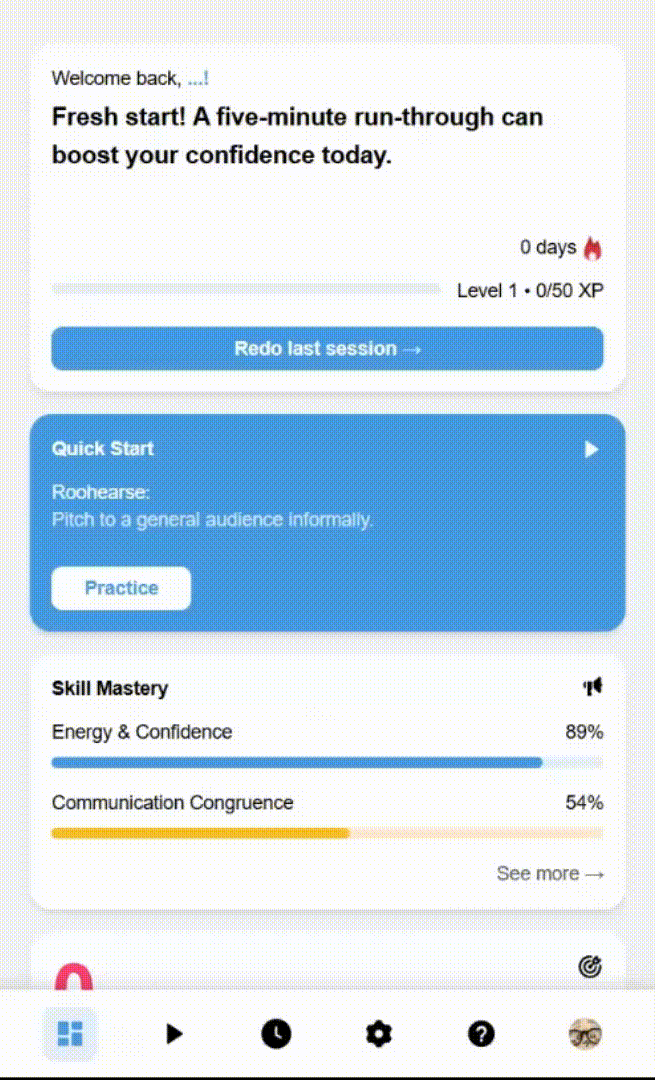
- Quick-start: "Redo last session" reduces the flow from 3-10 clicks down to 2
Step 3: Design System
I created a Tailwind-based style guide with accessible color combinations, typography scale, and reusable components (buttons with all states, cards, progress bars).
Step 4: Implementation
I built the dashboard in React/Next.js with Tailwind, implementing the designs I created. The growth chart uses Recharts. I made the layout fully responsive for desktop and mobile.
Key Decisions
Here's how I made critical design choices:
| Decision | Why |
|---|---|
| "Welcome back, [First Name]!" | Personalization increases engagement |
| Single primary color (blue) | Creates visual focus and hierarchy |
| XP bar at top | Immediate progress visibility |
| Redo last session button | 2 clicks vs. 3-10 before |
| Growth chart locked until 5 sessions | Avoids discouraging new users with empty charts |
Tools: Figma · React · Next.js · Tailwind · Recharts
Reflections
This project pushed me beyond "does it look good?" to "does it make users want to come back?" Gamification isn't just badges,it's surfacing progress at moments that matter. Every design decision served one purpose: reduce friction, increase motivation, and make practice feel rewarding.


.gif)